How to Design Instagram Highlights That Perfectly Match Your Brand Aesthetic (Step-by-Step Guide)
Why Instagram Highlights Matter for Your Brand
The Role of Highlights in First Impressions
When someone lands on your Instagram profile, one of the first things they see is your Highlights. These little circles might seem minor, but they’re a big part of your brand identity. They tell your story, showcase your best content, and give visitors an at-a-glance look at who you are and what you offer.
Story Highlights vs Regular Stories
Unlike regular stories that vanish after 24 hours, Highlights are pinned to your profile permanently—until you remove or change them. That means they act like mini landing pages for your content categories.
Understanding Your Brand Identity
Define Your Brand Voice
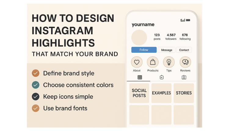
Before you open any design tools, revisit your brand style:
- Are you playful or professional?
- Is your tone calm or energetic?
- What emotions do you want your followers to feel?
Color Palette, Fonts, and Style
Use your brand’s existing colors, fonts, and textures. Your Highlights should mirror what users see in your logo, feed, website, or packaging.
Design Principles for Instagram Highlight Covers
Simplicity and Readability
Instagram Highlight covers are small, so avoid clutter. Stick to:
- One symbol or short word
- High contrast
- Plenty of negative space
Consistency Over Creativity
It’s better to keep all icons in a similar style (e.g., all outlined or filled, all monochrome or full color) than to experiment too much with different looks.
Tools You Can Use to Design Highlight Covers
User-Friendly Tools
- Canva – Templates, drag-and-drop icons, and free elements
- Adobe Express – Sleek layouts and customizable templates
- Figma – Ideal for precision design and collaboration
Free Icons & Templates
- Flaticon.com
- Iconscout.com
- Unsplash & Pexels for minimal backgrounds
Step-by-Step: How to Create Instagram Highlight Covers
- Open your design tool (Canva/Figma)
- Set your canvas size to 1080 x 1920 pixels
- Choose a background color from your brand palette
- Place an icon or symbol in the center
- Add optional text if necessary—but keep it short
- Export in PNG format for high quality
Tip: Save versions with and without text, depending on your strategy.
Where to Find Free Design Assets
- Icons: The Noun Project, Flaticon
- Backgrounds: Unsplash, Pexels
- Fonts: Google Fonts, DaFont
- Mockups: Smartmockups, Placeit
Matching Highlight Covers with Feed Aesthetic
How to Sync Colors and Vibes
Use the same filters or color overlays used in your grid. If your feed is pastel, don’t go bold with Highlights—and vice versa.
Using Brand Guidelines
Reference your brand style guide to maintain consistency in tone, iconography, and color use.
Uploading and Organizing Highlights on Instagram
How to Add or Edit a Highlight Cover
- Tap the Highlight
- Tap “More” > “Edit Highlight”
- Tap “Edit Cover”
- Choose your design from your camera roll
- Zoom to crop and position it perfectly
Renaming and Reordering Tips
- Use clear, short names like: FAQs, Shop, Tips, About
- Reorder Highlights by adding a new story to bump it forward
10 Creative Highlight Category Ideas
| Category | Purpose |
| Behind the Scenes | Build transparency & trust |
| Testimonials | Showcase client feedback |
| FAQs | Answer common questions |
| Shop | Feature products/services |
| Portfolio | Show off your work |
| Events | Highlight past/upcoming events |
| Tutorials | Educate and provide value |
| Team | Humanize your brand |
| Offers & Promos | Share exclusive discounts |
| Reviews | Collect social proof in one place |
Dos and Don’ts of Highlight Design
✅ Dos
- Use your brand fonts and colors
- Keep icons centered and clean
- Ensure contrast for visibility
❌ Don’ts
- Use tiny, unreadable text
- Upload blurry or low-res images
- Mix random styles that clash with your brand
Real Examples of On-Brand Instagram Highlights
Example 1: Minimal Skincare Brand
- Uses muted tones and thin line icons
- Covers labeled “Routine,” “Glow Tips,” “Ingredients”
Example 2: Bold Fashion Label
- Neon colors with bold sans-serif typography
- Covers: “Runway,” “Drops,” “Collabs,” “Styling”
How Often Should You Update Highlight Covers?
Seasonal Themes
Update with festive or seasonal variations for holidays, sales, or launches.
During Rebrands or Campaigns
If you change your logo, palette, or visual tone—update your Highlights to match.
Mistakes to Avoid When Designing Highlights
- Clashing colors with your feed
- Using complex icons that don’t scale down well
- Inconsistent spacing or misalignment
- Forgetting to test visibility on mobile
Bonus: Animated Highlight Covers – Worth It?
What They Are
Short looping animations instead of static icons.
Pros and Cons
Pros: Eye-catching, unique
Cons: Harder to create, can clash with still feed
How to Create One
Use apps like Mojo, Adobe After Effects, or Canva Pro
Accessibility Tips for Highlight Design
- Use high contrast between background and icon
- Avoid using color alone to convey meaning
- Stick to simple symbols for universal understanding
Frequently Asked Questions (FAQs)
Q1: What size should my Instagram Highlight covers be?
1080 x 1920 pixels is ideal for clarity and quality.
Q2: Do I need to post to my story to add a Highlight?
Yes, add the design to a story first, then save it to a Highlight.
Q3: How many Highlights can I have?
Instagram allows up to 100 Highlights.
Q4: Can I use text instead of icons?
Yes—but make sure the font is readable at a small scale.
Q5: Should I match my feed aesthetic exactly?
Yes, for visual consistency and brand recognition.
Q6: Can I design Highlight covers on mobile?
Absolutely! Tools like Canva and Adobe Express work on mobile too.


