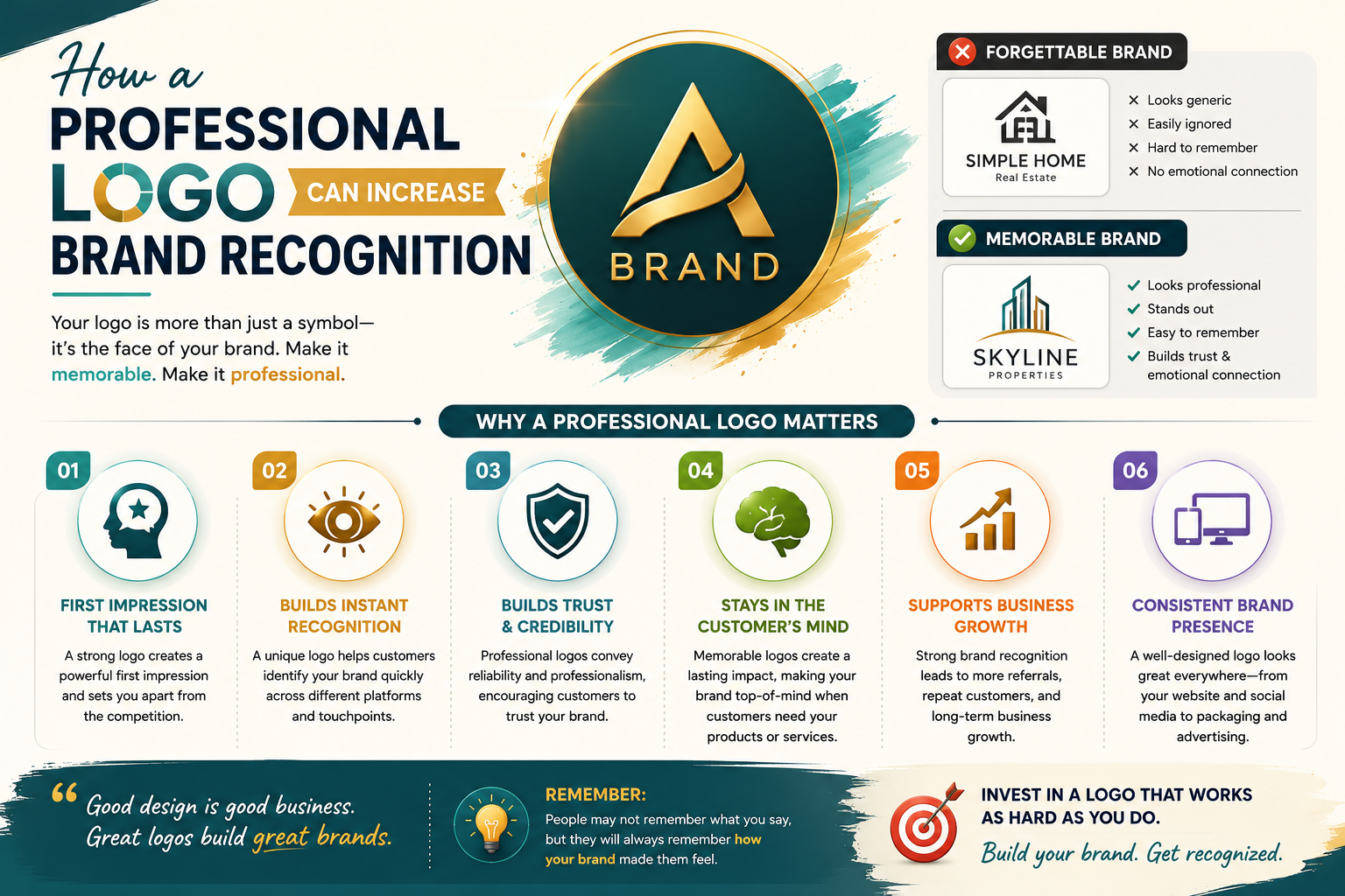
How a Professional Logo Can Increase Brand Recognition
By a brand strategy and visual identity consultant with 10+ years of experience working with small and medium businesses across Gujarat and India.
Nishaben spent two years building something worth being proud of.
Her organic spice business in Anand, Gujarat started in a spare room with a grinding machine and direct relationships with farmers in three villages she had visited personally. Her turmeric was from Kheda district, her cumin from Banaskantha, her coriander from a cooperative in Mehsana. The traceability, the quality, the care in sourcing — all of it was real, and the people who tried the product could taste it.
For those two years, she sold under a handwritten label on a plastic container. Her name, a phone number, and the spice name. That was it.
A grocery store manager in Vadodara had been ordering from her informally for eight months. Small quantities, cash payment, no invoice. He liked the product. He just was not quite ready to treat it as a supplier relationship.
Three months after Nishaben invested ₹12,000 in a professional logo, a label system, and a consistent colour palette, he placed his first formal bulk order. He told her, in the WhatsApp message confirming the order: "The product always felt good. Now it looks like it belongs next to the other proper brands."
The product had not changed. Not a gram of it. What changed was how he perceived it — and, as a result, how he was willing to engage with it commercially.
This article explains why that shift happens, what the research says about how visual identity affects buyer behaviour, and what small businesses in Gujarat can do to make their brand mark work as hard as their product does.
What "Branding" Actually Means — and Why the Logo Is Its Most Important Expression
Branding is one of those words that gets used so often it has become nearly meaningless. Let me give you the version that is actually useful.
Your brand is the total impression a stranger forms about your business before they have spoken to you, tried your product, or visited your website. It is assembled from everything visible: your logo, your colours, your packaging, your social media presence, and the consistency — or the conspicuous lack of it — across all of those surfaces.
The logo is not the brand. That distinction matters. But the logo is the single most visible representation of the brand — the mark that appears on every customer touchpoint, from your WhatsApp Business profile to your invoice to the front of your shop to the box your product ships in. Done well, it is a visual shortcut that accumulates recognition and trust every time it is encountered. Done badly, or done cheaply, it is a signal the business owner almost certainly does not intend to be sending.
Expert insight: Marty Neumeier, author of The Brand Gap — one of the most widely referenced texts in brand strategy — defines a brand as "a person's gut feeling about a product, service, or organisation." His key observation: brands are not what companies say they are, they are what customers feel when they encounter them. The logo is the most consistent trigger for that gut feeling, because it appears everywhere the brand appears. A professional, well-designed logo triggers a positive gut feeling before any other signal is processed. An amateur one triggers doubt, also before any other signal is processed.
The numbers that make this concrete
Lucidpress, which analyses brand performance across organisations of all sizes, found that consistent brand presentation across all platforms increases revenue by an average of 23%. The same product, the same team, the same market — nearly a quarter more revenue simply from presenting the business coherently and professionally across every touchpoint.
Nielsen's Visual Identity research adds a related dimension: colour alone can increase brand recognition by up to 80%. Think about how immediately you identify certain brands purely from their colour, before reading a word. The specific red-white of one soft drink. The distinctive teal of a certain bank. The orange of a well-known logistics company. These instant associations are not accidents — they are the result of consistent visual repetition, starting with a professional, intentional design choice.
For a small business in Gujarat competing in a market where buyers are choosing between multiple options, these numbers are not abstract. They translate directly into which business earns the first call, the first inquiry, the first wholesale order — even when product quality is identical across competitors.
A transparency note: These statistics describe averages across a large population of businesses. Individual results depend on your specific market, product category, and how consistently the branding is implemented. The figures represent the direction of effect, not a guaranteed outcome for any particular business.
The Seven-Second Assessment — and What Happens During It
Princeton University researchers found that people form initial impressions of credibility within seven seconds of encountering a brand. On a website, that window compresses to approximately three seconds, according to eye-tracking research from the Nielsen Norman Group. In a physical retail environment, it happens the moment a customer's eye lands on your product among its competitors on a shelf.
What is happening during those seconds is not conscious evaluation. The viewer's brain is running a rapid, largely automatic pattern-match: does this look like the kind of business I trust? The inputs to that judgment are almost entirely visual.
Expert insight: Dr. Robert Cialdini's research on influence and decision-making, documented in Influence: The Psychology of Persuasion, identifies what he calls the "liking" and "authority" heuristics — mental shortcuts that humans use to make fast decisions about trustworthiness. Visual design quality activates the authority heuristic: professionally designed materials signal that the business behind them is established and competent, before any factual evaluation takes place. This is why visual quality affects credibility judgments so rapidly and so consistently — it is triggering a heuristic response, not a deliberative one.
What a logo is communicating before a word is read
A well-designed logo is doing several things simultaneously in those first seconds.
Professionalism. A logo that looks custom, intentional, and crafted signals that the business behind it takes itself seriously and invests in quality. A generic logo made in a free online tool signals the opposite, even to viewers who could not articulate why they feel uncertain about it. The signal is processed before any conscious thought about logo quality has occurred.
Industry and category. A good logo communicates what kind of business you are through what designers call "visual language" — the specific combination of typeface style, icon treatment, and colour choices that positions a business within a recognisable category. A pharmaceutical company and a children's clothing brand use completely different visual vocabularies not because designers made random choices, but because those vocabularies carry meaning that audiences read largely unconsciously. Violating category visual conventions — a bright, playful design for a legal firm, for example — creates cognitive friction that reduces trust.
Values and personality. Whether a business presents as modern or traditional, premium or accessible, playful or serious, artisan or industrial, is communicated primarily through visual identity. Nishaben's handwritten label communicated "home-made." Her professional rebrand — earthy terracotta tones drawn from Gujarat's pottery tradition, hand-drawn botanical elements referencing actual cumin and coriander plants, warm serif typography — communicated "artisan producer with heritage and intention." Both positions are legitimate businesses. Only the second one allowed her to command higher prices and access wholesale relationships with buyers who had professional standards for their suppliers.
The cost of getting this wrong
Stanford University's Web Credibility Research Project found that 75% of consumers judge a business's credibility based on its visual design quality — before evaluating any other factor. Three quarters of the people who encounter your business are forming a credibility assessment based almost entirely on how it looks.
Nishaben's two years with a handwritten label were two years in which a significant proportion of potential wholesale buyers looked at her product and categorised it, rightly or wrongly, as a small home operation rather than a supplier worth a formal relationship. Her quality was not the limiting factor. Her visual identity was.
Practical implementation tip: Conduct a "stranger test" on your own branding. Show your logo, label, or website to three people who are unfamiliar with your business and ask them: "What kind of business does this look like? Is it established? Would you trust it?" Their answers, without any explanation from you, reveal what your visual identity is currently communicating to every buyer who encounters it.
The Part Most Business Owners Underestimate: Consistency
A beautiful logo used inconsistently is significantly less effective than a simpler logo used everywhere, always the same.
Recognition builds through repetition. Every time a customer or buyer encounters your brand mark in the same form, in the same colours, at the same quality, the association accumulates in their memory. That accumulated familiarity becomes recognition, and recognition becomes the first step toward trust. It is a compounding process — the hundredth encounter is worth more than the sum of the first ninety, because the pattern is now deeply established.
What I tell businesses I work with is to think about their "visual fingerprint" — the specific, consistent combination of logo, colour palette, and typography that makes their brand immediately identifiable across every surface where it appears.
For a small business, this means:
- The same logo file, in the same colours, on your website header, your Instagram profile, your WhatsApp Business display picture, your invoice template, your packaging, and your shop signage. Not a resized version, not a version recreated from memory when the original files were lost. The same mark.
- The same two or three brand colours specified by hex codes and, where relevant, Pantone references — not "similar" colours, the exact values, so that your brand colours are reproducible by any designer or printer at any time.
- The same typeface for your business name and headings across all materials.
- A documented rule about logo placement: which background colours work, what minimum size is acceptable, whether a white version exists for dark backgrounds and when to use it.
This is what a brand guideline document codifies. For a small business, even a one-page visual identity reference — logo files in the correct formats, colour codes, font names — is sufficient to maintain consistency across every designer, printer, and developer you will ever work with.
Expert insight: Brand strategist Debbie Millman, host of the long-running Design Matters podcast and author of multiple books on brand identity, has documented extensively how brand recognition is a function of consistent repetition over time rather than any single visual quality. Her research and case work show that businesses which maintain consistent visual identities over three to five years develop what she calls "visual equity" — an accumulated recognition asset that cannot be bought with advertising alone and that compounds significantly in the second and third years. The inverse is equally documented: businesses that change their visual identity frequently reset their recognition accumulation each time.
What inconsistency looks like in practice — and why it matters commercially
The Lucidpress 23% revenue figure requires genuine consistency to materialise. A logo that is stretched here, recoloured there, and replaced with a different version somewhere else is not building recognition — it is actively undermining the cumulative effect that makes visual identity valuable.
Consider two ceramic tile manufacturers in Morbi — both making comparable products, competing for the same international buyers. One has a professional, consistent logo that appears identically across office signage, catalogue, website, and business cards. The other has a logo on the office that differs subtly from the catalogue version that differs again from the website — slightly different proportions, slightly different colours, possibly a different wordmark treatment because the original file was lost and recreated. The first business looks established and systematic. The second looks like it is still being assembled.
When an international buyer from Europe or Southeast Asia is evaluating two potential suppliers with similar samples and similar pricing, the visual consistency of the one is a signal about operational discipline and professionalism generally. The inconsistency of the other raises a quiet question: if the basic branding is not managed carefully, what else might not be?
Practical implementation: Create a "master brand folder" on your computer or cloud storage with the following files: your logo in AI or EPS vector format, your logo as an SVG, your logo as a PNG with transparent background, your logo in white/inverted version, and a one-page document with your exact colour hex codes, Pantone references, and the font name used. Share this folder with every designer, developer, and printer you work with. This single action eliminates the inconsistency that accumulates when different people recreate your logo from their own resources.
What Successful Indian Brands Actually Teach Small Businesses
You do not need to look beyond India to understand how visual identity compounds into genuine brand equity. Two examples from within Gujarat's own cultural context make the principles concrete.
Amul — six decades of the same mark
Amul's visual identity — the logo, the specific red and white, the Amul girl — has been maintained with remarkable consistency since the 1960s. Six decades. Through enormous product expansion, through changing consumer preferences, through the shift from print to digital to social media.
Every time an Indian consumer encounters those visual elements, six decades of accumulated association activate simultaneously: quality dairy, Gujarati heritage, trust, value for money. That is the compounding return on visual consistency — something no advertising campaign budget can replicate, because it is built from time and repetition rather than spend.
The strategic lesson: Amul has made incremental refinements to its identity over the decades — the Amul girl's look has evolved subtly, the typography has been modernised slightly — but the core visual elements have never been dramatically altered. This is the appropriate way to manage a brand identity over time: protect the equity accumulated in the recognisable elements while allowing careful, incremental modernisation. The most dangerous moment in a brand's life is when a founder decides the logo "looks a bit dated" and commissions a dramatic redesign. Every significant visual change resets accumulated recognition. The businesses that build the strongest brand equity are almost always the ones that choose a professional identity and commit to it.
Fabindia — when the visual becomes the values
Fabindia's visual identity — earthy tones, craft textures, warm and traditional typography — does not simply identify the brand. It communicates the brand's entire value proposition before any copy is read. A customer who encounters a Fabindia bag in an unfamiliar market understands, from the look alone, that this business cares about Indian craftsmanship and traditional production.
That is the most sophisticated function a visual identity can perform: making the brand's values legible through design alone, without requiring any explanation.
This principle directly informed Nishaben's rebrand. Her designer did not produce a generic "natural and organic" identity — the category defaults (green, leaf icons, clean sans-serif type) — because those visual conventions communicate nothing specific about Nishaben's story or her product's differentiation. Instead, the design drew on specific visual references: terracotta and ochre tones from Gujarat's pottery tradition, botanical illustrations that referenced actual cumin and coriander plants, a serif typeface that communicated warmth and heritage without being archaic. The visual identity became honest storytelling in design form — and that honesty, visible before any text was read, was part of what convinced the Vadodara grocery manager that the product had arrived at a different level.
The pattern across Gujarat's own competitive sectors
In Gujarat's diamond and jewellery industry — one of the most intensely competitive B2B environments in the country — businesses that invest in professional visual identity consistently command higher prices and attract more reliable international buyers than those presenting without clear visual differentiation. I have observed this pattern directly across multiple clients in the sector over several years.
In Surat's textile market, manufacturers with recognisable brand identities build more sustainable trading relationships than those competing solely on price, because the brand communicates stability and systemic operation to buyers managing multiple supplier relationships. The visual identity signals: this supplier is organised enough to have consistent branding, which means they are probably organised enough to manage a consistent supply relationship.
The mechanism is consistent across sectors: professional visual identity increases perceived value, which supports higher prices, better relationships, and more qualified inbound interest — often from buyers the business did not need to seek out.
Five Things That Separate a Working Logo from a Wasted One
Not every professionally produced logo achieves what it should. The following five qualities determine whether a mark is genuinely doing the job it needs to do — and each one has a practical test you can apply to your own logo right now.
Simplicity. The most recognised logos globally are almost uniformly simple. They are reducible to a single, clear, distinctive element that is legible at small sizes and memorable after a single encounter. The test: can you sketch the rough outline of your logo from memory? If you cannot — if it has too many elements, too much detail, too much complexity to be recalled — it is failing the memorability requirement.
Scalability. A professional logo must work at every size, from a 48-pixel WhatsApp profile picture to a 3-metre outdoor banner at a trade exhibition. This requires the mark to be designed as a vector file (SVG or AI format) that scales without quality loss, and the design itself must remain legible at very small sizes. The test: open your logo at the size it appears as a favicon in a browser tab. Can you still read it and recognise it? If it becomes an unreadable blob, the design needs to be simplified or a separate icon version needs to be created.
Distinctiveness. A logo that looks generically similar to other logos in your category is not building recognition — it is contributing to visual confusion. The test: search your industry category on Google Image Search. Look at the logos of your ten nearest competitors. Does yours look noticeably different from theirs? If not, it is not differentiating you.
Colour intentionality. Logo colours are not personal preference. They carry specific, documented psychological associations: blue communicates trust and professionalism; green suggests growth and nature; orange signals energy and warmth; red conveys urgency and appetite; black communicates luxury and authority; yellow suggests optimism and accessibility. These associations are consistent across cultures and extensively documented in colour psychology research. The test: list the associations of your brand's colours. Do they align with what you want your business to communicate? If your colour choices reflect personal preference rather than deliberate communication strategy, they may be sending the wrong signals.
Complete format delivery. A professionally delivered logo includes a master vector file (AI or EPS), an SVG for digital use, PNG files with transparent backgrounds in full colour and single-colour versions, and a white or inverted version for dark backgrounds. The test: can you immediately provide your printer with a vector file of your logo? If not — if your "professional" logo exists only as a JPEG or a low-resolution PNG — you did not receive complete professional delivery, and you will encounter problems every time you need to reproduce the mark at a new size or on a new material.
Conclusion: It Is Already Working. The Question Is Which Direction.
Nishaben's handwritten label was not neutral for the two years it was on her product. It was actively communicating something to every buyer who encountered it — communicating something that was limiting her prices, constraining her buyer relationships, and closing doors she did not know existed.
The ₹12,000 investment in professional branding recovered its cost within the first quarter — the grocery store manager's bulk order alone covered it. What the rebrand continued to do, over the following eighteen months, was open conversations that the old label would have ended before they began: with grocery chains, food service buyers, and export-focused distributors who wanted to list an "artisan Gujarat spice brand" rather than a generic commodity.
Your logo is working right now. Every time a potential buyer or customer encounters it — on your website, your packaging, your social media, your business card, your vehicle signage — it is communicating something about your business. The question is whether what it communicates is accurate, professional, and building the cumulative recognition that makes visual identity valuable over time.
If it looks amateur, it is telling buyers your business is less serious than your product deserves. If it is inconsistent across your materials, it is failing to accumulate the recognition that makes repetition valuable. If it was made in a free tool or is a stock icon with your name added, it is indistinguishable from thousands of other businesses using the same asset — which means your visual identity is doing nothing to differentiate you in a market where differentiation is everything.
Professional branding is not a luxury. In the competitive markets of Gujarat — where buyers have genuine choices, where price competition is intense, and where the first impression a product or service makes is often the only one that matters — it is one of the most consequential investments a small business can make. Because it determines how every buyer judges your business in the seconds before they decide whether to take the next step.
5 — FAQ section (schema-ready)
Why is a professional logo important for a small business?
A professional logo is important because it is the first signal of credibility a potential customer or buyer encounters. Princeton University research shows people form credibility impressions within seven seconds of encountering a brand — and those impressions are based almost entirely on visual quality. Stanford University's Web Credibility Research Project found that 75% of consumers judge business credibility based on visual design quality before evaluating any other factor. For a small business with no existing reputation, the logo is often the only signal available for that initial assessment.
How much does professional logo design cost in India?
Professional logo design in India varies significantly by scope and provider. A freelance designer in Gujarat typically charges ₹5,000 to ₹20,000 for a logo with basic file delivery. A professional branding agency with strategic input, a complete visual identity system (logo, colour palette, typography, brand guidelines), and full file delivery across all formats typically charges ₹15,000 to ₹60,000 or more depending on complexity. Avoid the cheapest options — a logo delivered only as a JPEG or low-resolution PNG is not professionally complete and will cause problems every time you need to reproduce it at a new size or on a new material.
What file formats should a professional logo be delivered in?
A professionally delivered logo should include: a master vector file in AI (Adobe Illustrator) or EPS format for print and scaling, an SVG file for digital use on websites, PNG files with transparent backgrounds in both full colour and single-colour versions, and a white or inverted version for use on dark backgrounds. If your logo was delivered only as a JPEG or a low-resolution PNG, you have received an incomplete logo that will produce quality problems when used on print materials, large banners, or professionally produced packaging.
How does brand consistency affect business revenue?
Lucidpress research found that consistent brand presentation across all platforms increases revenue by an average of 23%. Consistency means your logo, colours, and typography appear identically across your website, packaging, social media, invoices, and any printed materials — not approximately the same, but the same exact hex codes, the same proportions, the same file each time. This consistency builds accumulated recognition with every customer encounter, and recognition is the foundation of trust. A logo used inconsistently provides only a fraction of this benefit.
What makes a logo design effective for brand recognition?
Five qualities determine whether a logo builds effective recognition: simplicity (complex logos lose impact at small sizes and resist memorability), scalability (must work from a 48-pixel WhatsApp profile picture to a 3-metre banner), distinctiveness (different enough from competitors to build specific recognition rather than category confusion), colour intentionality (colours chosen for their psychological associations rather than personal preference), and complete file delivery (vector files that can be reproduced at any size without quality loss). A logo can be professionally designed and still fail if any of these qualities are missing.
How often should a business change or update its logo?
Brand recognition is built through consistent repetition over time — every logo change resets some of the accumulated visual equity. Most small businesses should treat their logo as a long-term asset, not a regularly updated design element. Appropriate changes are minor refinements (slight modernisation of typography or proportions) made gradually over years. Dramatic redesigns should only happen when a business has fundamentally changed its positioning, market, or values. The most successful Indian brand examples — Amul being the clearest case — have maintained their core visual identity with only incremental refinement across many decades.
Want a Visual Identity That Works as Hard as Your Business Does?
If your current logo is limiting your buyer relationships or your pricing, or if you are building a new business and want to establish the right visual foundation from the beginning, Help Me Buddy IT Pvt Ltd designs professional brand identities for small and medium businesses across Gujarat and India.
We do not produce templates. We start with your business, your specific market, and the buyers you need to reach — then design a visual identity that communicates accurately, builds recognition consistently, and grows in value over time. Logo, colour system, typography, complete file delivery in every format you will need, and a brand guideline document that maintains consistency when you work with designers, printers, and developers.
🎨 Book a free brand consultation. We will review your current visual identity, identify what it is communicating that you may not intend, and show you what a professional alternative could look like for your business and your market specifically.
Visit helpmebuddy.in or message us on WhatsApp.
Because your logo is making an impression on every buyer who encounters it. That impression is either building your business or working against it.
Comments
Share your thoughts about this post.