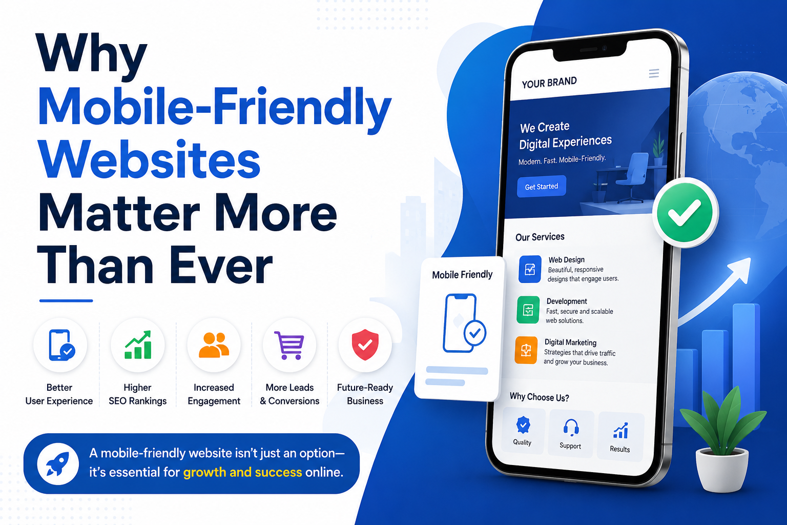
Why Mobile-Friendly Websites Matter More Than Ever
Imagine visiting a website on your smartphone only to find tiny text, broken layouts, slow loading pages, and buttons that are impossible to tap. Chances are you’ll leave within seconds—and so will most of your potential customers.
In today’s digital world, mobile devices have become the primary way people browse the internet, search for local businesses, shop online, and connect with brands. If your website isn’t optimized for mobile users, you’re losing valuable traffic, potential customers, and search engine rankings.
At Help Me Buddy, we help businesses build modern, responsive, and SEO-friendly websites that perform seamlessly across all devices. Whether you’re a startup, local business, or established company, investing in a mobile-friendly website is no longer optional—it’s essential.
👉 Learn more about our professional web development services: https://helpmebuddy.in/
Blog Outline
1. Introduction
· Rise of mobile internet usage
· Importance of responsive web design
· Why businesses can’t ignore mobile users anymore
2. Mobile Usage Trends Continue to Grow
· Smartphone usage statistics
· Mobile shopping and local searches
· Consumer behavior changes
3. Google’s Mobile-First Indexing
· What is Mobile-First Indexing?
· Why Google prioritizes mobile websites
· SEO benefits of responsive websites
4. Better User Experience (UX)
· Faster navigation
· Readability
· Touch-friendly interfaces
· Lower bounce rates
5. Higher Conversion Rates
· Better engagement
· Increased inquiries
· More online sales
· Improved lead generation
6. Essential Features of a Mobile-Friendly Website
· Responsive design
· Fast loading speed
· Mobile navigation
· Optimized images
· Click-to-call buttons
· Easy contact forms
7. How Help Me Buddy Can Help
· Responsive website development
· Website redesign
· Speed optimization
· SEO optimization
· Mobile performance improvements
Mobile Usage Trends Continue to Grow
Mobile internet usage has experienced remarkable growth over the past decade. Today, the majority of users browse websites directly from their smartphones instead of desktop computers.
Whether someone wants to:
· Search for nearby businesses
· Book appointments
· Buy products online
· Read blogs
· Contact service providers
they’re most likely doing it on a mobile device.
Consumers expect websites to load quickly, display perfectly, and offer effortless navigation. If your website fails to meet these expectations, visitors simply move on to a competitor.
Businesses that invest in responsive web design position themselves to capture this growing audience while improving customer satisfaction.
Google’s Mobile-First Indexing Explained
One of the biggest reasons mobile optimization matters is Google’s Mobile-First Indexing.
Instead of evaluating your desktop website first, Google primarily uses the mobile version of your website when determining search rankings.
This means:
· Mobile performance affects SEO.
· Poor mobile usability can reduce rankings.
· Responsive websites perform better in search results.
· Mobile speed directly influences user satisfaction.
If your website isn’t mobile-friendly, your visibility on Google may suffer—even if your desktop website looks excellent.
That’s why businesses should prioritize responsive design from the beginning.
Better User Experience Means Happier Customers
User experience is one of the strongest factors influencing whether visitors stay on your website or leave immediately.
A mobile-friendly website provides:
Easy Navigation
Menus are simple.
Buttons are easy to tap.
Visitors quickly find information.
Readable Content
No zooming required.
Proper spacing.
Comfortable font sizes.
Faster Loading Pages
Nobody likes waiting.
Fast-loading websites reduce bounce rates and encourage visitors to explore additional pages.
Improved Accessibility
Responsive websites adapt to every screen size, ensuring users enjoy the same experience regardless of the device they’re using.
Happy visitors are more likely to become paying customers.
Mobile-Friendly Websites Increase Conversion Rates
Traffic alone doesn’t grow your business.
Conversions do.
A responsive website helps improve:
More Contact Form Submissions
Simple mobile forms encourage users to inquire instantly.
More Phone Calls
Clickable phone numbers make contacting businesses effortless.
Higher Online Sales
Customers enjoy smooth checkout experiences.
Increased Appointment Bookings
Booking services becomes easier on smartphones.
Better Customer Trust
Professional mobile experiences build credibility and confidence.
Small improvements in usability often result in significantly higher conversion rates.
Essential Features Every Mobile-Friendly Website Should Have
Not all responsive websites are created equally.
A high-performing mobile website should include:
Responsive Layout
Automatically adjusts to every screen size.
Fast Loading Speed
Optimized code and compressed images improve performance.
Mobile Navigation
Simple menus that are easy to use with one hand.
Optimized Images
Images should resize without affecting loading speed.
Click-to-Call Buttons
Allow visitors to contact your business with a single tap.
Easy Contact Forms
Keep forms short and user-friendly.
Secure HTTPS Connection
Protect visitor information while improving trust.
SEO Optimization
Well-structured content helps improve rankings and visibility.
Common Mistakes Businesses Make
Many businesses unintentionally hurt their mobile experience by:
· Using tiny fonts
· Adding popups that cover the screen
· Slow hosting
· Large uncompressed images
· Difficult navigation
· Long forms
· Non-responsive layouts
Avoiding these issues can dramatically improve user engagement.
Why Mobile Optimization Improves Local SEO
Most local searches now happen on mobile devices.
Examples include:
· Restaurants near me
· Website development company
· Digital marketing agency
· Best salon nearby
· Emergency services
· Hotels nearby
Google favors businesses that provide excellent mobile experiences because users are more likely to complete actions quickly.
Responsive websites also work better with Google Business Profile listings and Maps results.
How Help Me Buddy Can Help
If your website isn’t delivering a seamless mobile experience, now is the perfect time to upgrade.
At Help Me Buddy, we specialize in:
· Responsive Website Development
· Website Redesign
· WordPress Development
· Website Speed Optimization
· SEO-Friendly Website Design
· Landing Page Development
· Business Website Development
· E-commerce Websites
· Mobile Optimization
· Technical SEO Improvements
Every website we create is designed with both users and search engines in mind.
Explore our services today: 👉 https://helpmebuddy.in/
Final Thoughts
Your website is often the first impression potential customers have of your business. In a mobile-first world, that impression happens on a smartphone more often than not.
A mobile-friendly website not only improves user experience but also boosts search engine rankings, builds trust, increases conversions, and supports long-term business growth.
If your current website isn’t optimized for today’s mobile users, you’re likely missing valuable opportunities every single day.
The good news is that it’s never too late to make the switch.
Investing in responsive web design today will help your business stay competitive tomorrow.
Upgrade Your Website Today
Ready to improve your website’s performance, SEO, and user experience?
Help Me Buddy offers professional responsive website development tailored to businesses of every size.
Whether you need a brand-new website or want to modernize your existing one, our experts are here to help.
✅ Responsive Design
✅ SEO Optimized
✅ Fast Loading
✅ Mobile Friendly
✅ Conversion Focused
👉 Visit us today: https://helpmebuddy.in/
Let’s build a website your customers—and Google—will love.
Frequently Asked Questions (FAQs)
1. What is a mobile-friendly website?
A mobile-friendly website automatically adjusts its layout, images, and content to fit smartphones, tablets, and different screen sizes, ensuring a smooth user experience.
2. Does a mobile-friendly website improve SEO?
Yes. Google uses mobile-first indexing, meaning the mobile version of your website plays a major role in determining search rankings.
3. What is responsive web design?
Responsive web design allows a website to automatically adapt to various screen sizes without requiring separate desktop and mobile versions.
4. Why do mobile users leave websites quickly?
Visitors often leave because of slow loading speeds, unreadable text, poor navigation, intrusive pop-ups, or layouts that don’t fit smaller screens.
5. How can I check if my website is mobile-friendly?
Open your website on different smartphones and tablets, check loading speed, readability, navigation, and ensure all buttons and forms are easy to use.
6. How often should I update my website for mobile compatibility?
Review your website regularly—especially after major design changes, CMS updates, or Google’s algorithm updates—to ensure it remains responsive and performs well across all devices.
Comments
Share your thoughts about this post.