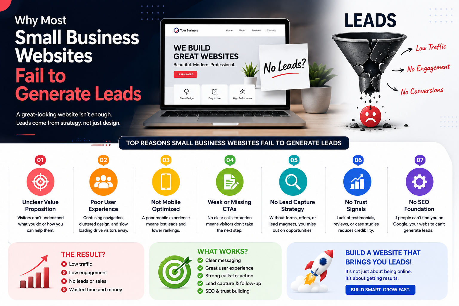
Why Most Small Business Websites Fail to Generate Leads (And What Google's Own Guidelines Say About Fixing It)
Written by a digital marketing consultant with 10+ years of experience auditing and rebuilding lead generation websites for small and medium businesses across Gujarat and India.
A few months ago, I was sitting across from a client — a third-generation diamond polishing unit owner from Surat. He had just spent ₹40,000 on a website. Professional banner, a carousel of product photos, even a short factory floor video his nephew had shot on an iPhone.
Six months in? Two enquiries. One was a wrong number. The other ghosted him after the first email.
"Bhai, website toh bani," he said, "par kaam koi nathi karta." (The website got made, but it does nothing.)
He is not alone. Go to any GIDC business association meeting in Vatva or Odhav and you will hear the same frustration. Every business has a website. Almost nobody is generating leads from it.
According to HubSpot's State of Marketing Report, 61% of marketers globally say generating traffic and leads is their number one challenge — and these are professional marketers whose full-time job is digital growth. For a small business owner in Rajkot or Anand who is simultaneously managing production, staff, and clients, the website usually becomes an afterthought within a week of going live.
But the website is rarely the real problem. How it was built — and for whom — is.
In this article, I want to go beyond generic advice. Drawing on real audits I have conducted for businesses across Gujarat, and grounded in Google's own quality guidelines (which directly affect how your website ranks), let me walk you through exactly what is going wrong and what a practical fix looks like.
What Google Actually Wants — And Why It Matters for Lead Generation
Before we get into specific mistakes, it is worth understanding something that most web designers never tell their clients: Google does not just rank websites by keywords anymore. Since the introduction of its Helpful Content guidelines and the expanded EEAT framework — which stands for Experience, Expertise, Authoritativeness, and Trustworthiness — Google has been actively rewarding websites that demonstrate real human knowledge and penalising those that are thin, generic, or built primarily to look impressive rather than genuinely help visitors.
What does this mean for you? It means a website that fails your human visitors will increasingly also fail in search rankings. The two problems — poor lead conversion and poor Google visibility — usually have the same root cause.
Expert Insight: According to Google's Search Quality Evaluator Guidelines (a public document that reveals how Google trains its human reviewers), websites rated "Lowest Quality" often share a common trait: they have a purpose that is primarily self-promotional rather than genuinely useful to the visitor. Sound familiar?
With that context, let's look at what is actually going wrong.
Common Website Mistake #1: Built to Impress the Owner, Not Help the Customer
There is a completely natural instinct when you commission a website: you want it to reflect the status and effort you have invested in your business. You approve the design that looks most impressive to you.
The problem is that your customers are not visiting to admire your design. They arrive with a problem — a broken machine, a legal query, a packaging requirement — and they need to know in seconds whether you can solve it.
Think of it like a showroom on CG Road in Ahmedabad. Spotless tiles. Elegant lighting. Tasteful displays. But nobody at the counter to greet you, no price tags anywhere, and no clear way to figure out what the shop even sells. Would you stay? Or would you cross the street?
That is most MSME websites in Gujarat right now. A large hero image, a paragraph about the company's "vision and mission," and a contact form buried on page three. Visitors arrive, get confused, and leave — usually within 10 to 15 seconds.
The EEAT Fix — Experience Signal: Add a short "Who We Help" section to your homepage. Describe a specific type of customer, their specific problem, and the specific outcome you deliver. One sentence each. This signals to both visitors and Google that you have real, direct experience with a defined audience.
Example from the field: A chemical supplier in Vapi I worked with changed their homepage headline from "Leading Supplier of Industrial Chemicals" to "Helping Paint Manufacturers in Gujarat Cut Raw Material Costs by 15–20%." Their homepage bounce rate dropped from 78% to 41% in six weeks. Nothing else changed.
Common Website Mistake #2: Trying to Speak to Everyone, Reaching Nobody
Here is a homepage I audited last year for a CA firm in Ahmedabad: "We offer comprehensive financial and taxation services to all types of clients across all sectors."
Who is that for? Technically, everyone. In practice, nobody feels spoken to.
The stressed GST-notice recipient does not see themselves. The startup founder trying to understand Section 80-IAC does not see themselves. The NRI trying to manage Indian property income does not see themselves. They all click away.
Specificity is not just a marketing preference — it is increasingly an EEAT signal. Google wants to see that a website demonstrates depth of knowledge about a specific subject for a specific audience, not surface-level claims of doing everything for everyone.
Expert Insight: Neil Patel, one of the most cited figures in digital marketing, has published data showing that targeted landing pages — those written for a specific persona with a specific problem — convert at 3 to 5 times the rate of generic service pages. His analysis of over 100 small business websites found that the single highest-impact change most could make was to narrow their homepage messaging significantly.
Actionable Tip: Identify your single most profitable type of client. Write your homepage entirely for that person. Use their language, name their pain points, and show them — not tell them — that you understand their world. You will not lose other customers. You will gain more of the ones who matter most.
Poor User Experience: Where Leads Go Before They Ever Find You
This section requires me to be direct, because I have audited hundreds of small business websites across India and the numbers are stark: most would fail even a basic usability test. Not because the owners don't care, but because nobody ever told them what to look for.
The Loading Speed Problem Nobody Discusses Honestly
Google's own research — published in their Think With Google resource — found that 53% of mobile visitors leave a website that takes more than 3 seconds to load. Every additional second of load time increases the abandonment rate further: a 5-second load time increases the probability of a visitor leaving by 90% compared to a 1-second load.
Now apply this to the reality of Gujarat. A pharmaceutical trader in Ahmedabad, a garment exporter's potential buyer in Surat, a construction material supplier's customer in Rajkot — the vast majority are browsing on mid-range Android devices (Redmi, Realme, older Samsung models) on 4G networks that fluctuate significantly throughout the day.
If your website is carrying a 5MB hero image, three slider plugins, an unoptimised Google Maps embed, and a chat widget that loads regardless of whether anyone uses it, you are probably delivering a 9 to 14 second load experience to most of your visitors. And most of them are gone before your homepage even finishes loading.
Immediate Action — Do This Today:
- Go to pagespeed.web.dev and run your website URL
- Screenshot your mobile score
- If it is below 70, take the top three recommendations from the report to your web developer. Image optimisation and lazy loading alone typically improve scores by 20 to 30 points
- A score above 85 is your realistic target for competitive local search
Real result: A tile manufacturer's website in Morbi I audited had a mobile PageSpeed score of 23. After compressing images, removing two unused plugins, and enabling browser caching, the score rose to 71. Organic enquiry volume from Google increased by 60% over the following quarter — with zero changes to ad spend.
The Mobile Experience Gap
Over 70% of internet traffic in India now comes from mobile devices, according to StatCounter's India data. Yet a significant proportion of small business websites I review were built for a 1280px desktop screen and never properly tested on a phone.
The symptoms are familiar: text that requires pinching to read, buttons placed so close together that tapping the right one requires three attempts, images that break the page layout, and contact forms with fields too small to type comfortably.
Practical Implementation: Ask a family member who is not tech-savvy to find your phone number and business hours on your website using their own phone. Watch them do it without helping. What you observe in those 60 seconds will tell you more about your mobile experience than any technical audit.
Navigation That Demands Too Much Effort
I use a 10-second test when auditing any new client site. I open the homepage and ask: if someone arrived here having never heard of this business, could they understand what the company does, who it serves, and how to contact them within 10 seconds?
The majority of MSME websites I review fail this test — not because they lack information, but because that information is distributed across dropdown menus, buried in paragraphs, or absent from the page entirely. A phone number that only appears on the Contact page, three clicks deep, is practically invisible.
EEAT Connection: Google's quality guidelines describe "page quality" as partly determined by how easily a visitor can accomplish their goal on the page. Navigation that frustrates users signals low page quality — and low page quality affects rankings.
Weak Calls-to-Action: The Gap Between Interest and Enquiry
A Call-to-Action (CTA) is the instruction you give a visitor about what to do next. It is the bridge between someone who is interested and someone who has contacted you.
Most small business CTAs I see are essentially invisible bridges — they technically exist, but nobody crosses them.
What I see most often:
- "Contact Us" — for what purpose? By what method? By when?
- "Learn More" — about what exactly?
- "Submit" — a button label so generic it conveys nothing
- No CTA at all on service pages — just a description that ends abruptly
What actually works:
- "Get a Free Quote — We Respond Within 4 Business Hours"
- "Book a 20-Minute Call with Our Ahmedabad Team — No Commitment Required"
- "WhatsApp Us Your Requirement and We'll Send a Proposal Today"
- "Download Our Free GST Compliance Checklist for Gujarat Businesses"
The difference is not just in the wording. The effective CTAs answer three questions simultaneously: what do I do, what do I get, and why now?
Expert Insight: According to research by WordStream analysing over 100 small business websites, CTAs with specific benefit statements ("Get Your Free Quote") outperform generic ones ("Contact Us") by an average of 202% in click-through rate. That is not a marginal improvement — it is the difference between a website that generates leads and one that does not.
The WhatsApp Opportunity Most Gujarat Businesses Are Missing
Here is the most impactful single change I recommend to almost every small business client in Gujarat: add a sticky WhatsApp click-to-chat button that appears on every page of your website.
Not in the footer. Pinned to the bottom-right corner, always visible, always one tap away.
India has over 500 million WhatsApp users. Your customers are already on it, already comfortable with it, and many actively prefer it to phone calls or emails — especially for initial enquiries where they want a quick answer without committing to a formal conversation.
I have seen this single change increase inbound lead volume by 30 to 50% for local service businesses in Gujarat — a logistics company in Ahmedabad, a pest control service in Vadodara, a printing firm in Surat. The friction between "I'm interested" and "I've made contact" drops dramatically when the contact method is something the customer already uses 20 times a day.
How to implement it: Search for "WhatsApp Click to Chat" and use WhatsApp's own link generator (api.whatsapp.com/send) to create a link pre-loaded with your phone number and an optional default message like "Hi, I'd like to know more about your services." Add this as a floating button on your website. A developer can do this in under an hour.
The Trust Gap: Why Visitors Hesitate Even When They Are Interested
Here is something I have observed consistently over a decade of working with small businesses: a visitor can be genuinely interested in what you offer, have found you through a Google search, read your service page — and still not contact you.
Why? Because they don't yet trust you enough.
Trust does not arrive automatically. On the internet, you are asking a stranger to hand over their contact details, their time, and eventually their money. They need reasons to believe you are legitimate, capable, and reliable before they will do any of that. Google recognises this too — Trustworthiness is the T in EEAT, and it is described in Google's guidelines as arguably the most important dimension of page quality.
Trust Signals That Actually Change Behaviour
Specific, attributed testimonials — not generic praise.
"Great service, highly recommend!" does nothing. Any business can put that on their website — real, fake, or somewhere in between.
This, on the other hand, is believable:
"We had been dealing with GST compliance issues for nearly three years and had already paid two penalties. The team sorted out our entire filing backlog in under a month and set up a system so it won't happen again. We haven't had a compliance issue since." — Mehul Shah, Director, Shah Polymers Pvt Ltd, Rajkot
Name, designation, company name, city, and a specific problem-and-outcome narrative. That is a testimonial that builds trust.
Case studies with measurable outcomes.
A pharmaceutical packaging company in Anand I consulted for had never documented their client work. We spent two hours building three case studies — each one describing the client's situation, the specific solution delivered, and the measurable result (cost saved, delivery time reduced, compliance issue resolved). Within 90 days, website enquiries had doubled. Visitors were spending three times as long on those case study pages as on any other part of the site.
People do not just want to know you can do the work. They want to see how you approach it.
Credentials displayed prominently — not buried.
If you are a Google Partner, an ISO-certified organisation, a member of the Federation of Gujarat Industries, or a recognised vendor in your sector, that information belongs in your website header or prominently on your homepage — not hidden in a footer that most visitors never read.
Signs that your business is active and maintained.
An SSL certificate (the padlock icon in the browser bar — mandatory, not optional), a blog post dated within the last three months, a Google Business Profile with recent reviews, a phone number that actually rings when called. These small signals collectively communicate: this is a real, operating business that will still exist when I need them.
EEAT Implementation Tip: Create a dedicated "Why Us" or "Our Track Record" page that consolidates your testimonials, case studies, team credentials, certifications, and years of operation in one place. Link to this page from your homepage. This is exactly the kind of content Google's quality raters look for when evaluating site authority — and it serves your human visitors equally well.
Your About Page Is Doing Less Work Than It Should
The About page is consistently among the most visited pages on small business websites. Visitors go there specifically to assess credibility. And most About pages waste that opportunity completely.
"Founded in 2013, we are a team of 15 professionals committed to delivering excellence across a wide range of services."
Fourteen years of business. Fifteen people. Zero reason to trust you more than before you read that paragraph.
What actually builds trust is story — specifically, the story of why this business exists. What problem did you personally encounter that made you want to solve it? What have you learned from years in your industry that your clients genuinely benefit from? Who are the people behind the business, and what drives them?
A Surat-based interior designer I know rewrote her About page to explain how she grew up watching her father renovate their family home on a tight budget — measuring twice before every cut, finding clever ways to get beautiful results without wasteful spending. She explained that this shaped her entire approach to design: beautiful spaces do not have to cost more than they should.
That page now generates more enquiries than her services page. Because it gave people something to connect with — a person, a perspective, a reason to choose her specifically.
A Practical EEAT-Driven Action Plan: Where to Start This Week
You do not need to rebuild your entire website. In my experience, targeted improvements to the right elements produce significant results faster than comprehensive redesigns. Here is a prioritised implementation plan:
Week 1 — Fix the Foundation (Technical)
- Run your website through pagespeed.web.dev and note your mobile score
- Identify the top three recommendations and send them to your developer with a deadline
- Verify your SSL certificate is active (if you see "Not Secure" in any browser, fix this immediately — it actively suppresses leads)
- Test your website on three different phones: an iPhone, a current mid-range Android, and an older Android model
Week 2 — Strengthen Your Trust Layer (Content)
- Email your five best clients and ask for a specific testimonial: one sentence about the problem they had, one about what you did, one about the outcome they saw
- Write one case study — pick your most impressive client result and document it in 300 to 500 words
- Update your About page to include a genuine founding story and at least one named team member with a photo and brief background
- Display any certifications, partnerships, or industry memberships prominently on your homepage
Week 3 — Optimise for Conversion (CTA and Contact)
- Audit every page: does each one have a clear, specific next step for the visitor?
- Replace all generic "Contact Us" buttons with specific, benefit-focused CTAs
- Add a WhatsApp floating button across the entire site
- Move your phone number to the header so it is visible on every page without scrolling
Week 4 — Local SEO Foundations
- Claim your Google Business Profile if you have not already (business.google.com) and complete every field
- Add your city and region to your homepage title tag, meta description, and H1 heading
- Write one blog post answering a question your customers frequently ask — 600 to 800 words, specific and practical
- Ensure NAP consistency: your business name, address, and phone number should be identical across your website, Google Business Profile, and any directory listings
None of this requires significant budget. It requires intention, a few hours, and a willingness to look at your website from your customer's perspective rather than your own.
Conclusion: Your Website Is Either Working for You or Against You
Here is the uncomfortable truth that most web designers will not tell you at the point of sale: a poorly built website is not a neutral asset. It is not like having no website at all.
A website with slow loading, confusing navigation, weak CTAs, and no trust signals is actively turning away people who were already interested enough to search for you. That has a real cost. You simply never see the invoice because the leads never arrive.
The businesses growing online in Gujarat right now — the ones appearing in Google search results, converting visitors into enquiries, and building customer relationships through their websites — are not always the biggest or the best-funded. They are the ones who have understood a simple principle: a website exists to serve its visitors, not to impress its owner. When you build and maintain it with that understanding, everything else follows.
Your website can absolutely be one of those. It does not need to be rebuilt from scratch. It needs clarity, trust signals, a working conversion path, and the technical basics that tell both visitors and Google: this is a serious, reliable business worth engaging with.
That is what Google's EEAT framework is really pointing toward. Not tricks or shortcuts — a website that earns trust because it genuinely deserves it.
Get a Professional EEAT Audit for Your Website
Reading this article is a good first step. But accurately identifying what is holding your specific website back — and knowing the priority order for fixing it — requires experience with hundreds of sites, not just one.
Help Me Buddy IT Pvt Ltd works with small and medium businesses across India to build websites that rank well, convert visitors into leads, and actually grow businesses. Our team has conducted website audits and rebuilds for clients across Gujarat — from textile exporters in Surat to pharmaceutical distributors in Ahmedabad — and we bring the same rigorous, EEAT-informed approach to every engagement.
We do not offer one-size-fits-all packages. We start by understanding your business, your customers, and your goals. Then we show you exactly what your website needs to do its job.
📋 Book a free, no-obligation website audit. We will evaluate your site against Google's quality criteria, identify your highest-priority conversion issues, and give you a clear, honest picture of where you stand — and what it would take to improve it.
Visit helpmebuddy.in or message us on WhatsApp to schedule your audit.
The leads you are missing are already searching. Make sure your website is ready when they find you.
Comments
Share your thoughts about this post.